- July 5, 2022
- Posted by: Administrator
- Category: Investing
In the last newsletter, we looked at some technical reasons for being wary of the stock market. This time around, we’ll look at the economic reality we face so you can decide whether the chances are worth taking a stand. First, though, let’s think about one more technical cause – volatility. Most people don’t consider volatility to be a sign of a healthy market. In fact, analysts use it as a way to assess when the market might crash.
Quite simply, when the market is more volatile, it means that prices are swinging up and down more wildly. This makes sense when you think about it – if everyone is buying and selling at the same time or in large amounts, prices are going to go up and down accordingly.
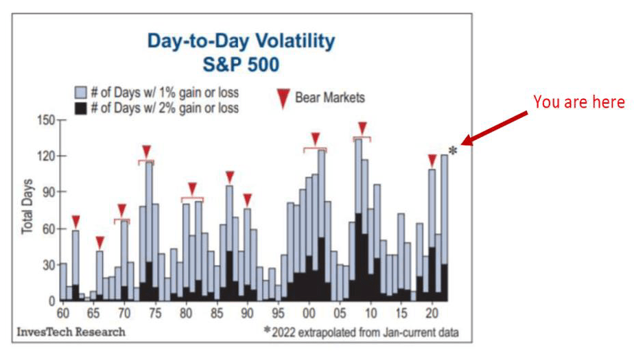
Stock Market Volatility
Lower volatility is typical of bull markets, which “boringly” rise. High volatility, whether up or down, is the signature of bear markets. The number of days when stocks increased by 1% or 2% in 1960 was tracked by InvesTech Research (below). It indicates a bear market when they begin to move in this direction (i.e., to the left of the red line).
The next thing to think about is market cycles. The market has always gone in cycles, and we’re currently in the longest bull market in history. That doesn’t mean a crash is inevitable, but it does mean that a significant correction is overdue. A lot of younger people now likely think that the market is like a machine, and that it just goes up and to the right.
However, that’s not how investing typically works. The stock market is made up of people, and people are emotional creatures. We get caught up in the moment and we make decisions based on our feelings. That’s why the market has these cycles – because people’s emotions ebb and flow.
When the market is going up, everyone feels great and they want to get in on the action. They feel like they’re missing out if they don’t invest. This drives prices up even further. Then, eventually, something happens that causes a sell-off. It could be a bad economic report, a terrorist attack, or anything else that spooks investors.
When everyone starts selling at the same time, prices go down. This can trigger a feedback loop where more and more people sell because they’re worried about losing money, which causes prices to fall even further. And then, eventually, buyers step in and start buying up assets at bargain prices.
A growth tax is made up of three components: the dollar, oil prices, and interest rates all going up at once. And that makes sense. A stronger dollar makes local goods more expensive, putting our exporters out of work. Simultaneously, it’s clear that higher oil costs affect us all. Furthermore, rising interest rates cause anything financed with debt to become more expensive.
We had a similar situation in 2008 with the housing market. So, what’s different this time around? The most obvious answer is that we’re already in a higher tax environment than we were during either of those two events.
Chart Comparisons
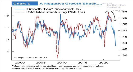
- The dotted line in the chart above represents the ISM Manufacturing PMIs. It’s a survey of manufacturing companies about their future growth prospects and does an excellent job predicting U.S. economic growth.
- The solid blue line is our growth tax, inverted (i.e., as the growth tax falls, it indicates that economic activity is declining). It’s inverted to demonstrate how rises have tracked with economic slowing, and vice-versa.
The dotted line lags the blue line by nine months, so this is looking to the future. Based on this chart, you can see that growth should be expected to slow over the remainder of the year dramatically.
Any other signs? Yes, the bond market.
Investing in Bond Markets
The bond market is the “intelligent money,” at least in terms of predicting where the economy is going. One useful approach for determining what it considers is to keep an eye on the yield curve. The yield curve is the difference between yields on Treasury bonds of various durations. In a healthy economy, longer bonds should produce a greater return than shorter bonds, because you’re being paid more to lock your money up for a longer period of time.
An inverted yield curve – where short-term rates are higher than long-term rates – is often considered a recessionary signal. That’s because it indicates that the market believes interest rates will fall in the future, which means economic activity is expected to slow.
The lender (bondholder) needs to be compensated for tying up their money. When these yields invert (i.e., short bonds begin yielding more than long bonds), it generally identifies future economic problems. As of this writing, the two-year vs. ten-year yield is at the lowest point since 2019, but the five-year vs. the ten-year has slightly inverted and even more so the seven-year vs. the ten-year. This 5/10 year inversion has only happened three times, going back to 2000.
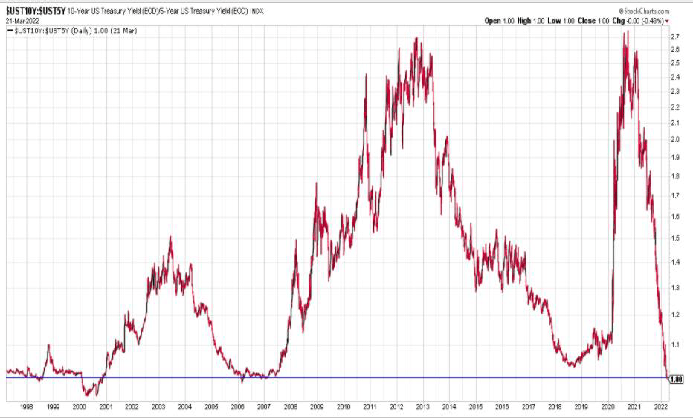
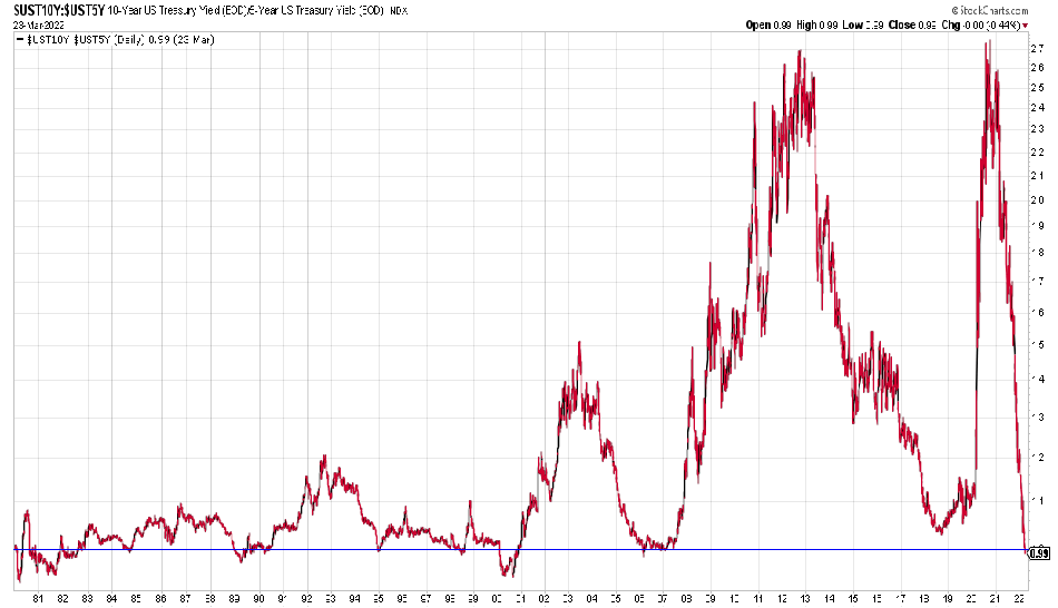
How did the stock market perform after the past inversions?
S&P-500 +0.73% -20.0% -34.62%
Of course, past performance is not necessarily indicative of future results.
The returns are approximate due to the nature of tracking the exact instant the curve inverts… But you get the idea.